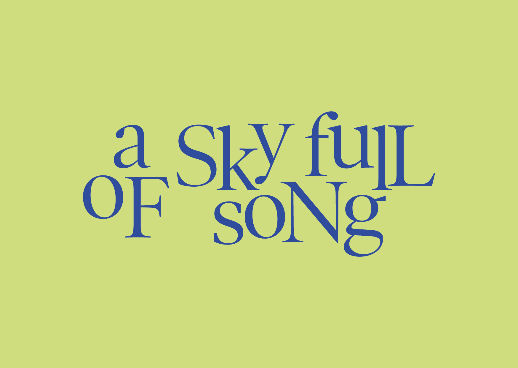
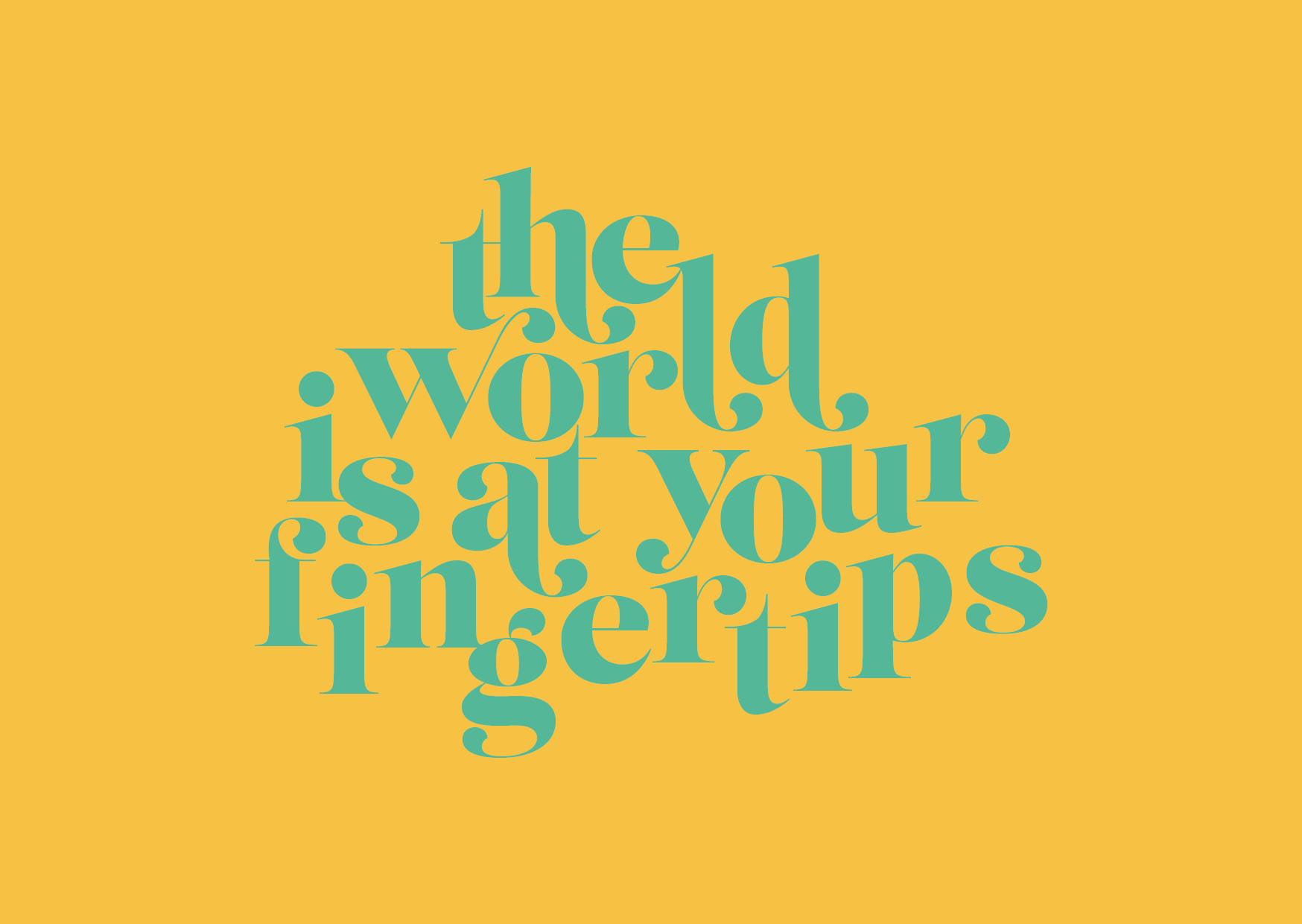
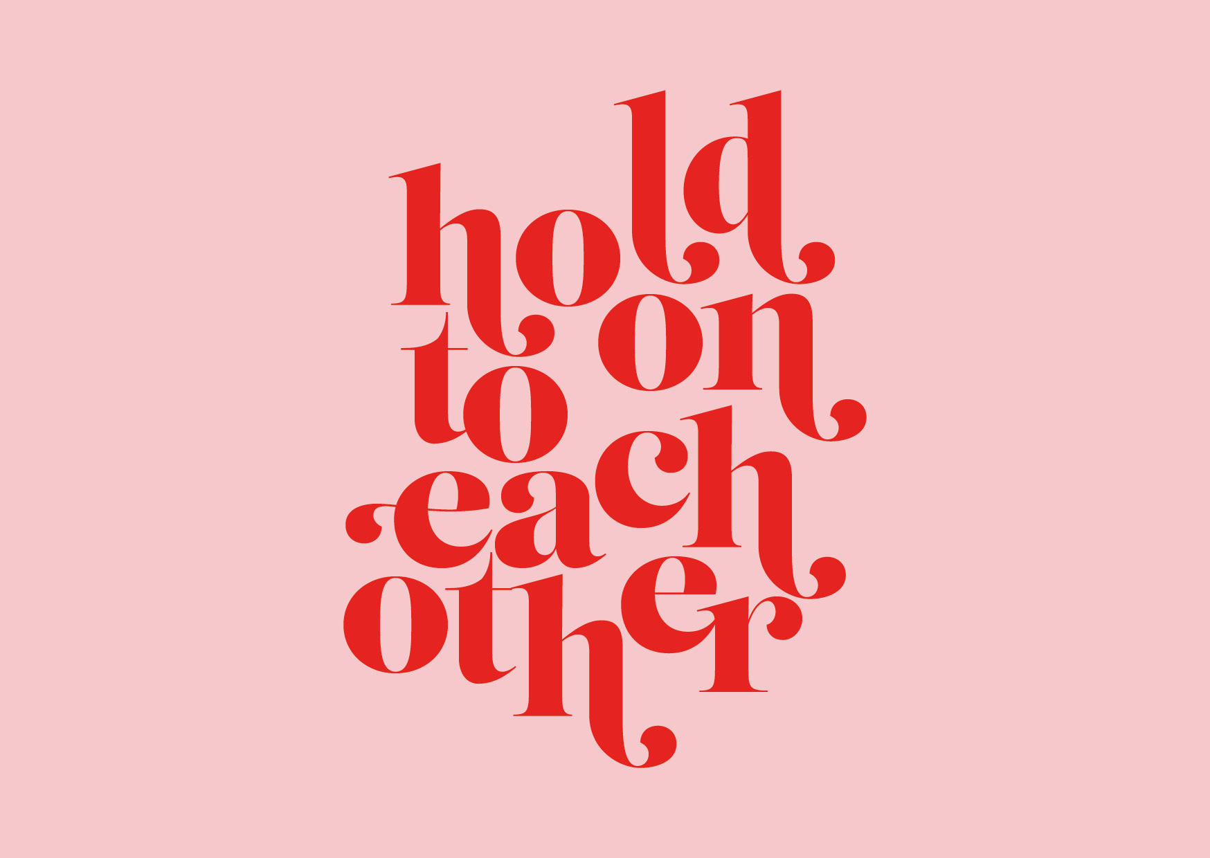
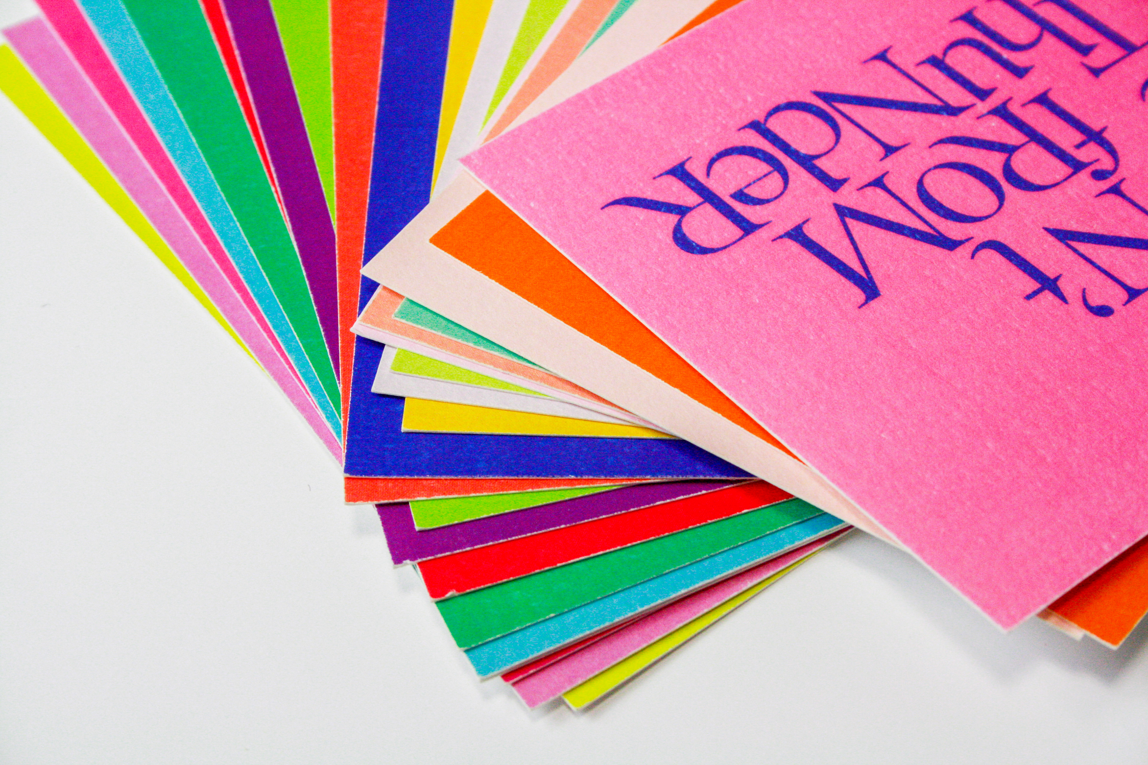
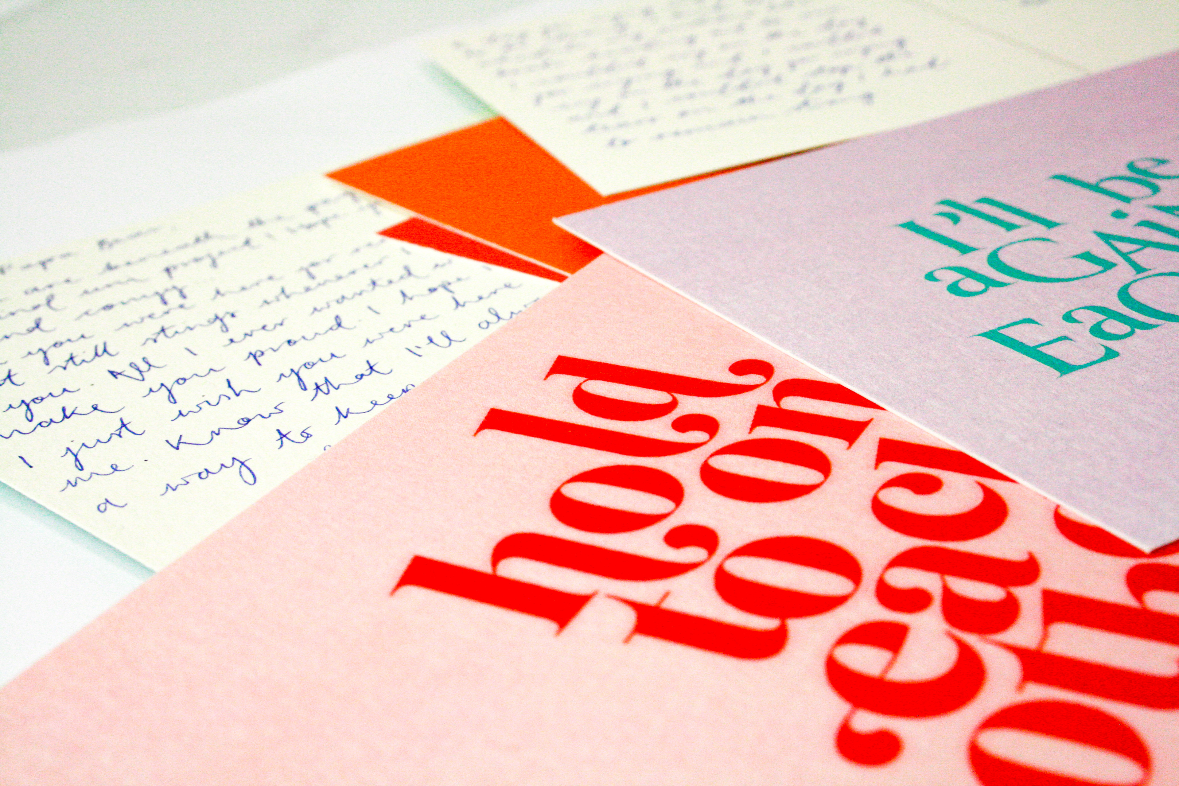
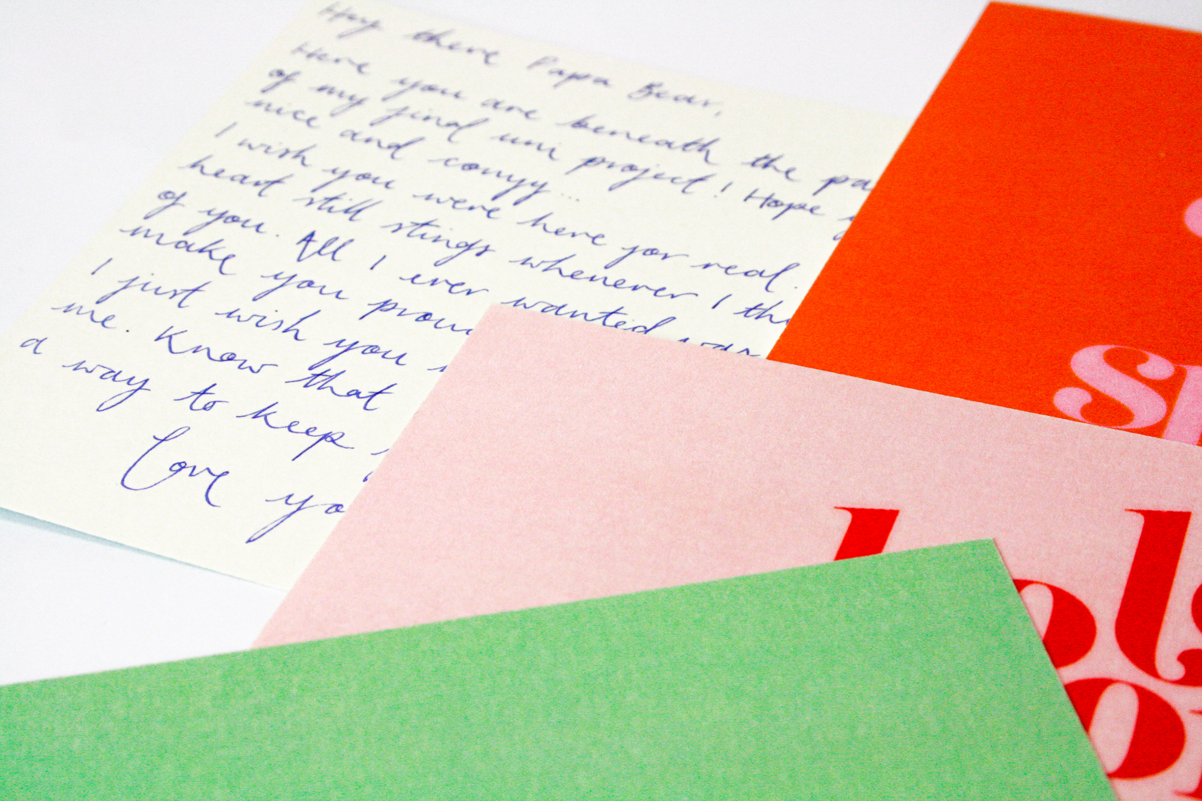
In the summer after second year my dad died. Just before that happened, one of my favourite artists Florence & The Machine released an immensley personal album; High As Hope. She also created a book of her song lyrics and poetry she’d written. In the week my dad was dying, the music and the written words were a huge comfort to me, and yet for six months after, I was completely unable to listen to it as it took me back to that time. Recently I was able to sit and listen to it again, and cried through every song. This album and the words it spoke got me through the hardest time of my life and I wanted to try and create something that symbolised how much it meant to me. Over the three years at university, one of the elements of my design that has improved the most is my typography and I now really enjoy manipulating type. I felt that given the immensley personal subject matter, I wanted to have some colourful typographic outcomes that radiated life - both the album and what it represents to me is the journey from darkness to light and everything inbetween. I decided to create postcards, not only did they emphasise the nostalgia felt, but it meant that I was able to write messages to my dad which created the a better sense of vulnerability.